While seiving through some of my older emails, I must admit I am quite impressed with one of them.
That particular email was talking about outstanding logos and “what’s behind them”.
They are really creatively!
Let's see how you feel about them.
- - - - - -
How many of you have noticed a hidden symbol in the Federal Express logo:
Yeah, I am talking about the 'arrow' that you can see between the E and the x. The arrow was introduced to underscore speed and precision, which are part of the positioning of the company.
This was a logo designed in-house for some internal event at IBM. I like that they are quite relaxed about the logo, unlike certain other companies who do not like the logo to be tampered with in any way even for internal promotions.
You might think the arrow does nothing here. But it says that amazon.com has everything from a to z and it also represents the smile brought to the customer's face. Wow, that is quite deep.
The SUN Microsystems logo is a wonderful example of symmetry and order. It was a brilliant observation that the letters u and n while arranged adjacent to each other look a lot like the letter S in a perpendicular direction. Spectacular.
This was a logo created for a puzzle game called Cluenatic. This game involves unravelling four clues. The logo has the letters C, L, U and E arranged as a maze. and from a distance, the logo looks like a key.
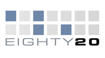
Eighty-20 is a small consulting company which does sophisticated financial modeling, as well as some solid database work. All their work is highly quantitative and relies on some serious computational power, and the logo is meant to convey it. People first guess that 20% of the squares are darkened, but that turns out to be false after counting them. The trick is to view the dark squares as 1's and the light squares as 0's. Then the top line reads 1010000 and the bottom line reads 0010100, which represent 80 and 20 in binary.
- - - - -
Creative enough? Haha.. Okay, for this matter, I know our views may differ.
These (big) companies have a clever way of using something simple to link up with them. Easy to remember, very representative, pretty impactful.
I am just thinking, if we were to ask to draw a logo to represent ourselves, how would that be like?
Maybe human being is too sophisticated and may not be easy to capture the full essence within a logo.
Maybe, I am just plain lazy, I just don't bother to try. But even if I were to try, I think I will end up drawing just a stick-man with my name written across it.
- - - - - - - - - -

有一位圣者这么说:
人是感情的动物,故常有情绪高潮、低潮、喜怒形于外的表现。
加上有时未能自治自律,而常把脾气迁怒于他人的行为。
更因随着环境而使心境变化万千,不能自主,
往往因小事的磨擦误会,而使无明之火以及嗔怒之气爆发。
所以修养的进步,
是在逐渐摆脱情绪反应的束缚,
解脱自我主观的支配,
以冷静地心情来应变动乱,
以判断的思考来明辨是非,
以热诚的态度来待人接物。


2 comments:
More to share...
http://38one.com/cleverblog/eight-logo-and-typeface
and http://38one.com/cleverblog (a list of them on the left)
Thanks.
Found many more interesting ones there. :o)
Post a Comment